eCommerce Search Filters – 13 Best Practices You Need to Implement ASAP to Increase Conversion Rate
As a shopper, finding a product that you need should be easy in any online shop, but more often than not, it isn’t. You have to deal with clumsy filters, outdated search functions, 0 result pages, and irrelevant results.
Using eCommerce search filters can fix all of these challenges, but there are a number of things retailers have to pay attention to in order to create a great shopping experience.
In this article, we will show you:
- filter design best practices
- what filters you should use
- how you should present them
and even give you a few SEO tips.
Let’s start with the basic question…
What Are eCommerce Search Filters?
Filters are essential tools for refining large amounts of information effectively by providing certain criteria and narrowing down the results by excluding the items that do not match the set criteria. eCommerce filters follow this exact logic, many times adding real-time results, and other convenient features to make filtering easier.
As Nielsen rightly states, filters and faceted search are often used as interchangeable concepts today, however, this is, in fact, not the reality.
Now, what is faceted search? While still quick and easy to use, it is a more complex process that uses a multitude of site search filters that can be automatically generated by the algorithm reading the different attributes present in the database.
- What Are eCommerce Search Filters?
- Why Use Product Filters?
- E-Commerce Product Filter Design Strategies
- Ecommerce Product Filter Types
- Product Filtering Implementations
- 6. Use category-specific filters
- 7. Use horizontally displayed promoted filters
- 8. Hide filters that lead to 0 result pages
- 9. Use real-time interactive filtering
- 10. Allow your customer to apply multiple filter values
- 11. Offer thematic filtering options
- 12. Make filter changes separate browser history events
- 13. Display the applied filters separately
- Key Takeaways
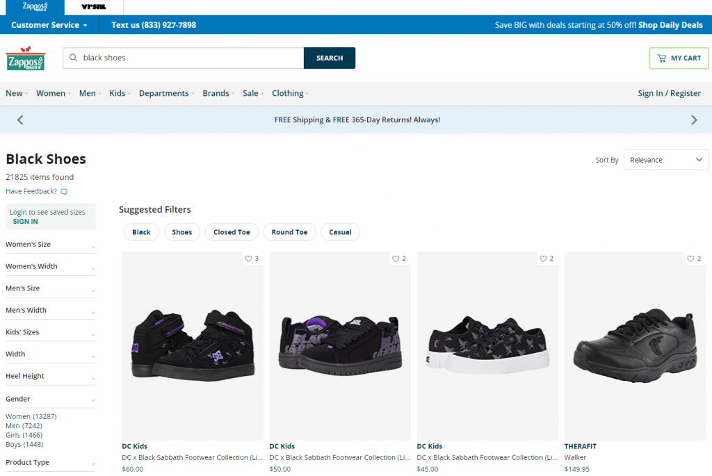
For example, if in an online store you type “black shoes” in the search box, you will likely get results containing either or both of those words. But if you want to narrow your search, you have to type in additional phrases and browse by relevance.
A good example for this is Zappos: if you put in the initial phrase, you will then be able to filter further by Women’s Size, Women’s Width, Men’s Size, Men’s Width, Kids’ Sizes, Width, Heel Height, and so on.
Why Use Product Filters?
Online shopping problems are in many cases caused by the customer’s inability to find what they are looking for in a quick and easy fashion.
There may be a lot of reasons for this, from a slowly loading site to horrendous design choices, but in a great number of cases, it can be distilled down to problems with the site search function and especially the use of filters – or the lack thereof.
But let’s dig in a bit deeper and talk about some of the exact benefits of using filters.
- Providing too many choices can confuse and overwhelm your customers. They can easily fall victim to the paradox of choice and leave your site without making a purchase, even if you have what they want.
- Filters narrow down the choices while still offering comparisons.
- Filtering also makes finding the ideal products much quicker than scrolling through endless category pages, and thus, also improve user experience.
By including search filters in your eCommerce store, you can greatly provide a much better user and customer experience to your visitors than even some multi-million dollar online retailers.
According to the Baymard Institute, which conducted a thorough analysis of many of the largest online stores:
Analyzing [71 Major eCommerce Sites] we’ve found the average site to perform mediocre at best, and 36% of sites to have such severe design and feature flaws that it was downright harmful to their users’ ability to find and select products.
In fact, according to Smashing Magazine, as many as:
- 42% of top e-commerce websites lack category-specific filter types,
- 20% of top e-commerce websites lack thematic filters,
- 32% of websites either have insufficient truncation design
and the list could be even longer. In fact, Baymard concluded that only 16% of the analyzed sites provided a good filtering experience.
In short: this is an area where you can easily compete with the largest online retailers in the world, and win.
E-Commerce Product Filter Design Strategies
First, let us look at a few basics about how you should present your filters to ensure the best user experience.
The most important things to think about are:
1. The best location for your filters
When thinking about the placement of your filters, you basically have two options: a horizontal filter bar on top of the page, or a vertical filter bar on the left side of the screen.
There are pros of each option.
- A horizontal filter bar will be more effective in focusing the attention of the shopper and in many cases will be more convenient to use.
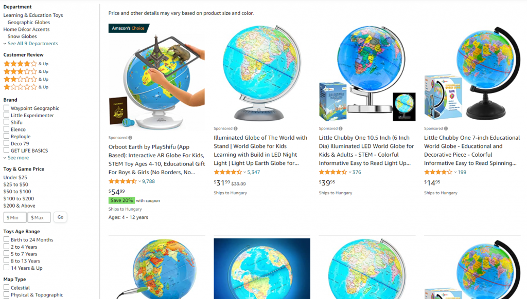
- A vertical sidebar on the left is where users are used to finding filters, so it offers a familiar experience, and it can also contain a much larger number of filtering options.
Amazon is one of the best-known examples for the vertical filter bar, offering even dozens of options depending on the products.
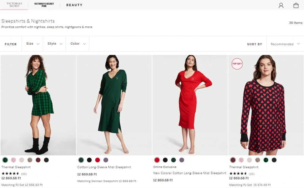
Victoria’s Secrets uses both: when you enter a search term, you are given a sidebar for faceted filtering, however, on category pages they opt for the simple horizontal bar, given there are fewer options inside a certain category:
2. Horizontal Search Bar: Design and Customer Experience
In addition to the two solutions above, Algolia has tIf you opt for a horizontal search bar, you have to pay very close attention to how you design it to keep the customer experience excellent.
- You will have limited space, so you might want to hide some of the filtering options – you can read about how to do it in the next few paragraphs.
- Make sure the drop-down menus don’t automatically disappear when the cursor is not hovering over them.
- Use icons to help shoppers quickly understand the options and to streamline navigation.
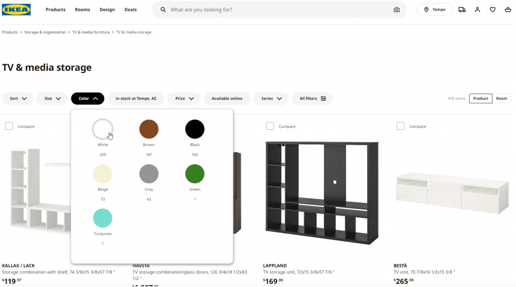
IKEA opts for a hybrid solution: on category pages, they present the most important filters horizontally, while also providing an option to open a vertical filter bar on the right for additional options.
And their main bar is also simplified, you can only see the first 4-5 options right away, so the drop-down menu doesn’t cover your entire screen.
3. Present your filters wisely
If you have a large number of filtering options, you have to make some compromises when presenting them to your shoppers. Shoppers have to be able to access all options while focusing mainly on the most popular and most frequently used ones.
There are a few ways to present the filters:
- You can offer all filtering options at once, which can be a bit overwhelming if there are a lot of them.
- You can add scrolling to the individual categories. Moving the mouse in and out of the different boxes where you want to scroll however can be a bit inconvenient and can cause accidental scrolling on the page itself.
- You can opt for showing only the filter categories or headers as drop-down options.
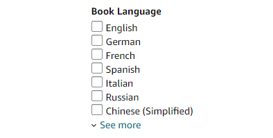
- You can use truncated filters, where you present some of the options – preferably the most popular ones – and provide a “show more” option.
The main goal is to restrict the length of the sidebar in order to present as many of the filter categories as possible while also hiding some of the specific options.
Pay attention to UX: if you decide to hide options behind a scroll, a drop-down menu, or a “show more” link, make sure that it is clear to the user how they can access the additional options. For example, you can use different colors for links and arrows.
4. Make sure applied filters are obvious
It is always important that the users understand exactly where they are in any process. This is also true for filtering, so the applied filters should always be obvious.
Shoppers should understand exactly which filters are applied and why they are viewing the given set of results. They should be able to easily make changes to the filtering options if they are not satisfied with the results.
You can make applied filters obvious in multiple ways, for example:
- With checked or filled checkboxes.
- Displaying cancellable tags.
- Providing a back arrow for selected subcategories to go back one level.
- Displaying the currently applied filters in a horizontal bar above the results.
The main goal is to make it easy for your shoppers to navigate amongst the applied (and non-applied) filters.
5. Your filtering decisions are SEO decisions, too
Apart from the user experience, you also have to take into account how different approaches to filtering affect your organic traffic.
For starters: filtering, and specially faceted filtering, are great tools, but they don’t in any way replace the need for category and subcategory pages.
For starters: filtering, and specially faceted filtering, are great tools, but they don’t in any way replace the need for category and subcategory pages.
This mainly has to do with your URLs – which are not primary ranking factors normally but bear weight in eCommerce. Here is how it works: you can’t put in-depth written content on category or product pages, your product descriptions can only be so detailed before they become counterproductive.
So what you do is create a category page. For example, if you want to rank for “leather jeans”, you will have a category page in your store with the URL
random.com/leather_jeans.
This is more likely to rank with all the products listed on it.
But this is only the smaller part.
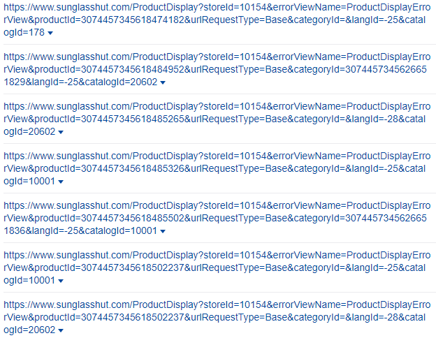
You see, faceted filtering, and basically any kind of dynamic filtering, even just using a simple search function in an online store tends to create a large number of result pages.
Every time someone enters a phrase, a new result page will be generated for the results, with the URL something along the lines of
random.com/search/products/?q=leather%20jeans
or
random.com/s?k=leather+jeans
and so on. And then the filters get added to that.
The first problem is duplication: now you have dozens, hundreds, or thousands of URLs with the same phrase. This can be mitigated by telling the developers to add canonical tags to the category pages for the phrases you want to rank for.
But this kind of endless page-creation presents another problem, albeit not a huge one. You can very easily end up with millions of pages under your domain, with 99% of them bearing basically the same, repeating thin content, like search results in a list in different orders.
To avoid this problem, it makes sense to have you developers indicate in the robots.txt that Google should ignore all search-related URLs.
Basically, you don’t want the majority of your crawled URLs to look like this:
Ecommerce Product Filter Types
Based on the type of products you are selling, there can be a myriad of attributes that your shoppers can filter for.
The most common ones used across eCommerce sites are:
- Brand
- Price (or price range)
- User ratings
- Color
- Material
- Size
- Theme (e.g. occasion)
- Popularity
Also, you can include filters for ongoing promotions.
Apart from these, if you use the right faceted search solution, you can automatically create any number of filters based on the attributes your products have, which makes it easier for your customers to find what they’re looking for.
Keep in mind that it also matters how you visualize these filtering options and how useable they are. To give you a good idea of the basic requirements for a good filtering experience, let’s talk about…
Product Filtering Implementations
6. Use category-specific filters
There are general eCommerce filters that can apply to a larger range of products, and which are very handy on category pages. They can narrow down the results without the need to specifically search for something. For example, in a store selling clothes, there will be a set of site search filters that can be generally applied to most products like gender, size, color, or price range.
But some of the eCommerce filters are very specific, they refer to the attributes of a given set of products – like when you search for books on Amazon, a filter may be offered so you can narrow down the results to specific award-winning books. This filter naturally won’t appear if you search for leggings.
These category-specific eCommerce filters should be treated uniquely. You should bring your shoppers’ attention to them to encourage filtering and thus provide a better customer experience.
So how can you do that?
7. Use horizontally displayed promoted filters
As we have seen in IKEA, they use a hybrid solution of horizontal and vertical filter bars, which makes sense because there is a great difference between eCommerce filter types even if they seem similar…
It makes sense to put category-specific filters horizontally on the top of the category page even if your faceted filtering solution appears in a sidebar. This way, they will not be overlooked.
You may call these “promoted filters”, which encourage shoppers to select one or more to get to their desired products faster.
But as with all horizontally displayed filters, they have to be curated carefully, because again, you have very limited space to present them.
If you use horizontally displayed promoted filters, these are some things you should keep in mind:
- Choose the most important filters: promoted filters don’t have to be consistent across the entire site. Choose the ones that are relevant in the given category, and display a handful of the most important ones like size, brand, price, etc.
- Display the promoted filters in the sidebar. A number of customers will instinctively look for filters in the sidebar, so don’t exclude your promoted filters. Display them in both positions to maximize their visibility.
- Promoting doesn’t mean overdoing design. The horizontal bar should be noticeable and easy to use, but avoid banner-like graphics, because they can be counterproductive and dissuade users from paying attention to the promoted filtering options.
8. Hide filters that lead to 0 result pages
We have talked about how to optimize 0 result pages in length before. However, ideally, you can prevent shoppers from ever reaching this dead-end in the first place.
With dynamic filtering, you should show the customer only the products that are in stock. So for example, if you are selling shirts, you may have a few category-specific filters pre-set, like color. Let’s say they have the option to choose if they want to see red, green, or blue shirts.
If you currently have no green shirt in store, two things can happen.
One: they select the “green” filter and are faced with a 0 result page.
Two: you automatically hide the “green” option, and only show the red and blue. This way, you avoid the frustration they might feel if they set a product filter that is unintentionally too narrow to return actual results. eCommerce Filters UX is as important as the overall user experience like the search autocomplete feature!
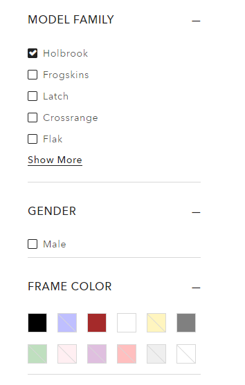
For example, here is Oakley’s store – they are a little more direct about this; they don’t hide the options, but instead make sure you understand that they are not active, as the Holbrook model family has no yellow or green models:
9. Use real-time interactive filtering
As a general rule, every process in your store should be as short and quick as possible. Not because you want to rush your customers to the check-out page, but because they should feel that the shopping process is easy and streamlined.
This also applies to search and filtering. Most stores use batch filtering, which means the user has to choose the desired filters then take an action – click on a button, usually – for the results to be displayed.
A much better solution is to use interactive filtering. This means that the results are instantly changed on the result page as soon as a filter is applied, no further action from the shopper is required.
This is especially handy if you have a great number of filtering options, as clicking a button every time the shopper wants to narrow down a search can get old quickly.
Batch filtering on the other hand can also have its own advantages, mainly if your site has issues with speed. This is of course an entirely different problem, but if you absolutely have to cut some corners, using batch filtering can help.

10. Allow your customer to apply multiple filter values
While shopping, people often want to see a wide range of options that cannot be described by one filter.
Let’s say they want to buy a book written by Isaac Asimov. Now, Asimov published almost 500 books in his lifetime, and on wildly different topics. He authored science-fiction and fantasy books, textbooks, mystery, thriller and horror books, and even cooking books.
They might be interested primarily in his fiction, but that means the customer has to look at a number of different genres because this includes sci-fi, fantasy, horror, and so on.
Interestingly, many online stores don’t offer the opportunity to select multiple filter values in certain filter categories. Many choices are mutually exclusive, so as a shopper if you want to broaden your search a bit, you have to discard the initial value and apply another – while memorizing the results from the first value.
This can be complicated and frustrating for shoppers.
So, always make it possible for people to select multiple values of a filter, and display all the results that match those values. If they want to narrow down their search, they can always discard some of the selected options.
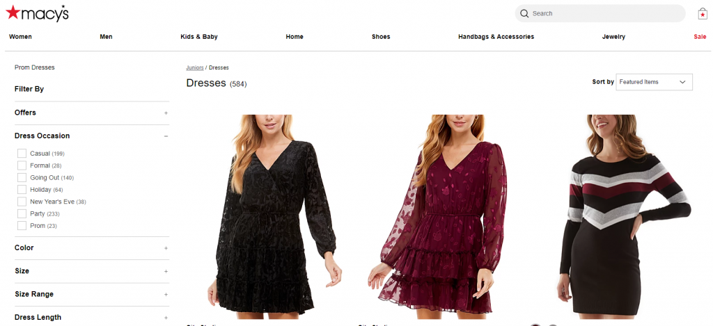
11. Offer thematic filtering options
For many products, plain attributes are not enough to filter results.
For example, if I am shopping for shoes, I already know what size I want to filter for, I also know what colors I like, if I want it to be waterproof, and so on. But mainly I want to filter by activity.
I might need it for running, hiking, for everyday commuting or for a certain social occasion. There might not be a separate category for all of these, but as a shop owner, you can take the products in a category and assign thematic filters to them.
This will help your customers locate the specific type of product they want and improve their experience on your site.
Macy’s for example offers an entire filter where you can select the exact occasion you need the dress for:
12. Make filter changes separate browser history events
If a customer narrows their search too much and wants to get back to the previous set of results, they may just discard the filter value they applied last. But many of them will do something else: hit the back button of the browser.
This is because when the displayed results change in front of their eyes, they tend to look at this as a new page – even if there was no apparent page reload.
And if they hit the back button, that can lead to an unpleasant experience if they are taken out of their search, and taken back to a category page for example.
The solution is to register every single filter application as a separate event in their browser history. You may think this can only be done if the page is reloaded each time, but luckily with the HTML5 History API you can preserve the seamless experience and still treat every filtering action as a separate event.
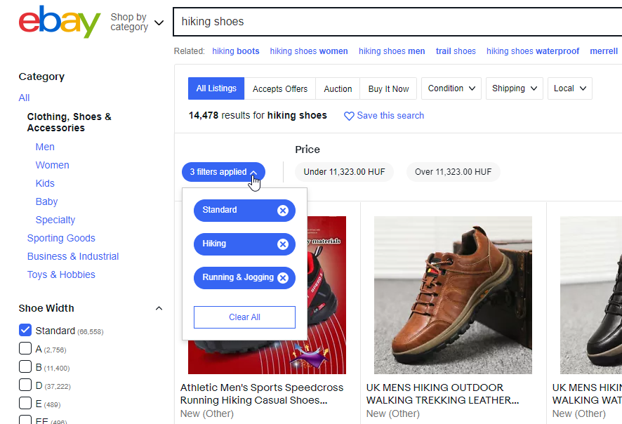
13. Display the applied filters separately
Make sure that your customers can always see which filters have they already applied – this makes it easier for them to navigate the results, discard filters, or apply more to further narrow down the results.
If you don’t display the applied filters separately, shoppers may misinterpret what they are seeing – especially if there are many filtering options as they might not remember what they already applied.
Applied filters should…
- Be displayed separately, while also being displayed in their original position.
- Be displayed on the top, in the horizontal bar, preferably.
- Be easy to deselect.
This way you can make it clear to shoppers what criteria affect the results they are seeing and provide convenient options to change them.
For example, eBay displays the selected filtering options right above the results, where you can deselect them with a single click:
Key Takeaways
Using filters that are optimized not just for your products, but for the behavior of your customers will increase your profits. It’s that simple.
Exits and cart abandonments will decrease, while average order value and overall conversion rate will increase.
This is because you make it quicker and easier for shoppers to find exactly what they are looking for, providing them with a great experience.
In order to do that, you must pay attention to the best practices and design your filtering solution in a way that can actually help.
If you do that, you can successfully outperform some of the largest brands and online retailers in the world.

Paige is the Head of Marketing at Prefixbox, a leading eCommerce site search solution. She’s an American who’s been living in Budapest since 2017 and loves giving #alwayslearning sessions to help people optimize their online stores.
