10 Autocomplete Search Best Practices – How Predictive Search Will Generate More Revenue for Your Store
One thing is certain: around 30% of your online store visitors will use your on-site search function – and 25% of them will click on a search suggestion.
If you provide suggestions, that is.
This is why predictive autocomplete search is an essential tool for any online retailer.
And we’re here to show you how to leverage it to maximize conversions and revenue.
We need something here that we want to clarify the basics first.
- What is Autocomplete Search?
- How does Autocomplete Search work?
- Achieve Better Sales via More Effective Autocomplete & Search Suggestions
- 10 Search Autocomplete Strategies
- 1. How Ranking the Suggestions Should Work
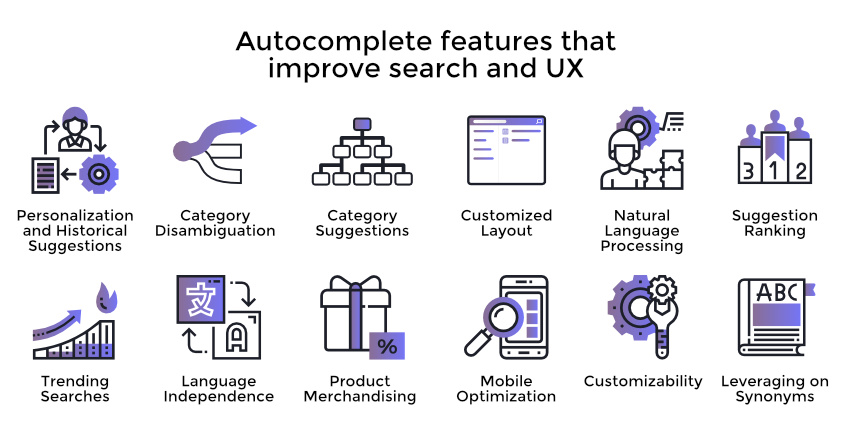
- 2. Personalization Makes Autocomplete Predictions More Effective
- 3. Keep Search Suggestions Simple and Few
- 4. Highlighting Autocomplete Suggestions
- 5. Provide Clear Instructions
- 6. Visual Focus and Simplicity
- 7. Support Both Mouse Interaction and Keyboard Navigation
- 8. Mobile Specific Optimizations
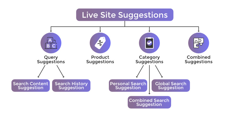
- 9. Provide Category Search Suggestions
- 10. Speed is Essential: Real-Time Autocomplete
- Summary
What is Autocomplete Search?
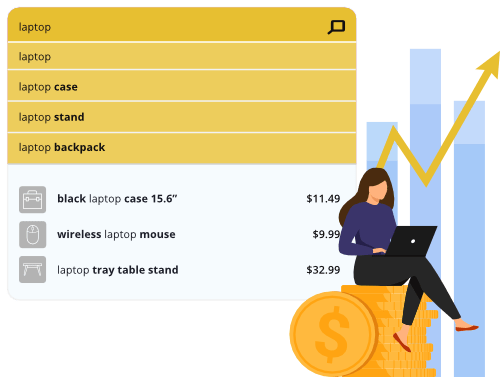
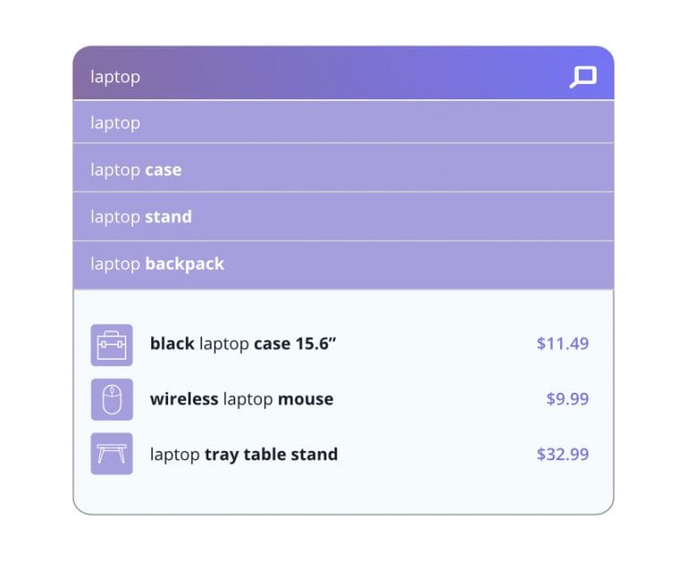
Autocomplete is the function of search engines that displays keyword and product suggestions in real-time, based on what search query the user is typing into the search field.
The feature works in a very simple way: it detects what a customer is typing, and matches the query with data in the search index. If there are keywords or phrases stored in the index that matches what’s being typed in, it suggests those.
In reality, it’s a bit more complicated because they also take into consideration the popularity of different products and keywords when ranking suggestions.
For example: in an online store selling clothes, if you type in “sh”, it might suggest shoes or shirts. If the store is selling bathroom appliances, it might suggest shower curtains or shelves.
How does Autocomplete Search work?
Apart from using your site’s search index, autocompletes also takes previous user behavior into account, as it keeps track of what queries were previously searched and clicked, and which led to a purchase.
There can be other factors that determine exactly which suggestions appear, and in what order, like the frequency certain terms are entered or click-through rates of individual suggestions.
Autosuggest vs Autocomplete – What’s The Difference?
Autosuggest is an input field that suggests words based on what search term you have typed so far. Autocomplete is an input field (search box) that automatically completes your entry for you, based on its own internal dictionary.
Achieve Better Sales via More Effective Autocomplete & Search Suggestions
There are many advantages of using autocomplete suggestion. If we want to summarize it, it helps shoppers make successful searches.
Here are some additional ways it improves the customer experience in your store:
- It decreases search time, as the user is presented with relevant suggestions and quickly arrives at what they are searching for.
- It makes the users more confident in the search and encourages them to add more details, leading to more precise matches.
- It decreases the number of times a user arrives to a 0 result page, which provides a better experience overall. If relevant queries that are connected to existing product pages,are suggested, it effectively guarantees a successful search.
- This also leads to the reduction in the number of people leaving your site, which means you have more time and opportunities to convert visitors to buyers.
- It also educates potential customers about your product range, working as kind of a soft cross- or upsell opportunity.
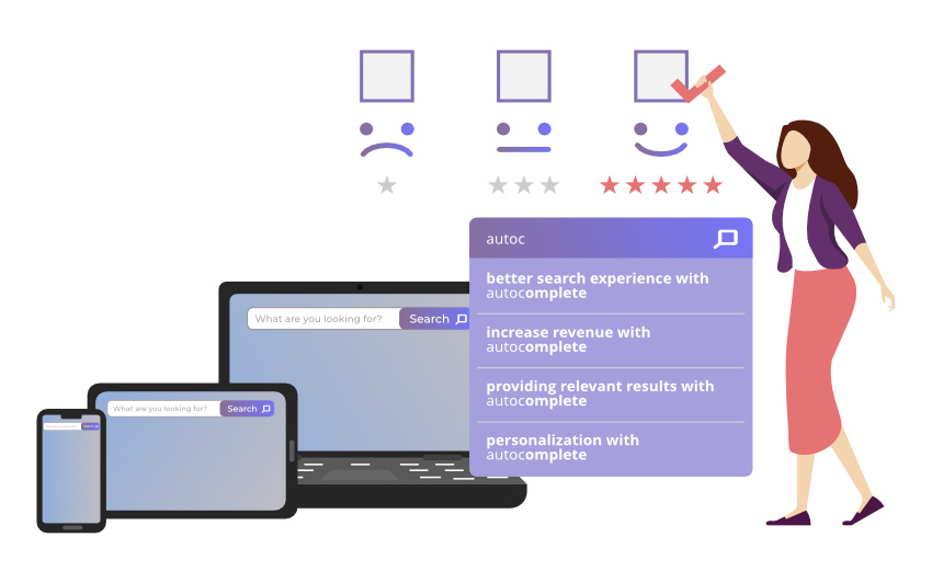
In short: by making search faster and ensuring relevant results, autocomplete will decrease exit rate, increase conversion rate and likely even your average order value.
We know from the B2C Retail Benchmark Report that
“Conversion rates are significantly higher where consumers have higher intent, i.e. they are searching for products.”
Now that we got through the basics, let’s dive into actual best practices to ensure those results we just talked about.
We included 10 of these with detailed descriptions here – let’s start with…
10 Search Autocomplete Strategies
1. How Ranking the Suggestions Should Work
Even with the best autocomplete functionality, you have a very limited number of chances to show the user the right queries, which makes ranking essential.
As we mentioned before, there can be many factors influencing the ranking of suggestions. Based on user behavior you can show popular searches (queries that entered most frequently) first.
You can also opt for ranking queries that are more frequently purchased. Or you can rank queries and products related to ongoing promotions or special offers first. (Learn more about digital merchandising strategies if you want to boost your sales with product promotion.)
Prefixbox’s Re-Ranking AI can take weight off your shoulders, and automatically ensure that the most relevant results appear first for search queries, by taking numerous kinds of historical data into account. Check our video on the importance of dynamic re-ranking as well:
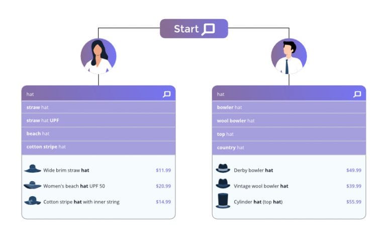
2. Personalization Makes Autocomplete Predictions More Effective
There are three basic ways you can personalize the autocomplete suggestion in on-site search:
- Consider the location of the customer, and show them queries that are popular in their area – or exclude ones that are irrelevant.
- Consider the language: if your online store is multilingual, show each user suggestions in their preferred language for a better user experience.
- Include their search history: make suggestions that are relevant to what they previously searched for on the site.
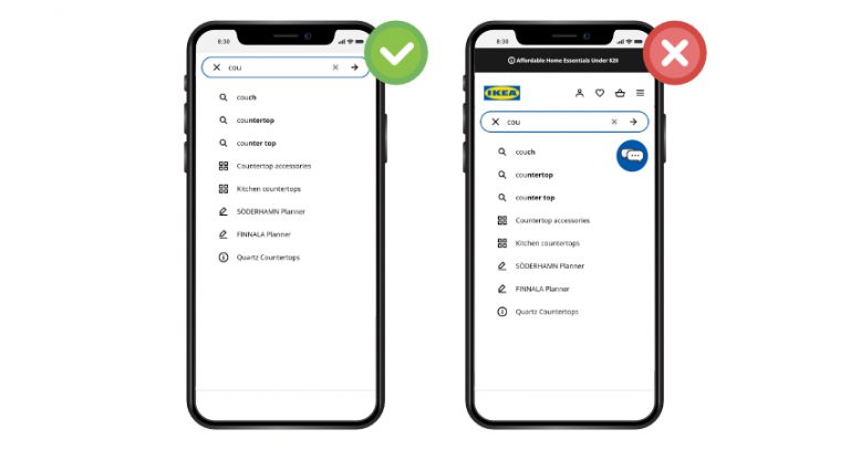
3. Keep Search Suggestions Simple and Few
Your suggestions should not extend the available space or clutter it – which is even more important on a mobile screen, considering that keyboards usually take up 30% of the screen.

a. Keep the Autocomplete List Manageable
The best practice is keeping your suggestions at 10 items or less (and this is why raking them correctly is essential).
If your suggestion list is longer than that, a number of unpleasant things can happen:
- It makes the search time longer, as the user scrolls through them.
Suggestions that appear off-screen may be ignored altogether. - The paradox of choice might kick in, leading to choice paralysis. This basically means that if we are presented with too many options, our brains often choose to just opt out entirely instead of wasting energy on weighing all of them.
- On a mobile screen, the preferred number of suggestions is 4-8, and may even be less if they include not only queries, but precise products with photos and descriptions.
If you want to display more keywords and products, consider a 2-column layout instead.
b. Avoid Scroll Bars
If your suggestions extend into an area accessible only by scrolling, again, there are many problems that can arise.
First, these initially hidden suggestions are likely to be ignored, but if they are not, search time increases again.
Also requiring an additional task from the user also deteriorates the experience. As does the fact that they can’t get a quick overview of their choices right away.
A search bar in the suggestion field can also cause technical problems with design, but we are not going to detail those here.
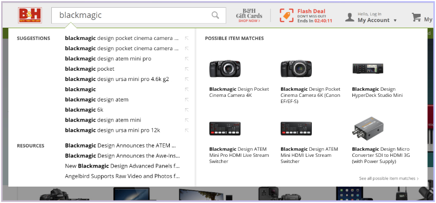
c. Reduce the Visual Noise
With modern on-site search solutions, the suggestion field can be filled with a large variety of elements like text, prices, photos, short descriptions etc.
While these can help shoppers, be careful not to include too many additional elements as it can drive the focus away from the actual suggestions and confuse the customers more than it helps them.
Our suggestion is to keep the visual noise to a minimum. Include both keyword and product suggestions, prices, and photos where relevant.
4. Highlighting Autocomplete Suggestions
Highlighting certain elements of your predictive suggestions helps the user keep their focus and use the feature more naturally. Here is what to keep an eye on.
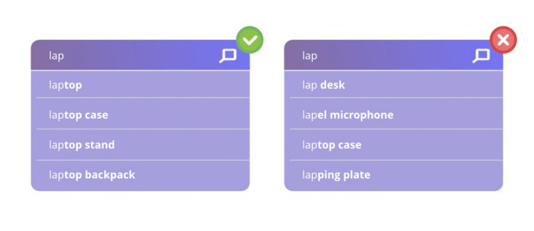
a. Highlight the Differences
Instead of highlighting (which usually means bolding) what the customer already typed in, it’s much more effective to instead highlight the predictive part of the suggestions.
This way they can focus on that more easily and determine the difference between suggestions, leading them to a faster decision.
b. Highlight the Active Suggestion
When choosing between suggestions, you should clearly indicate which one the users’ mouse is hovering over or which one is active for shoppers using keyboard navigation (which must be supported in your autocomplete feature).
This provides clarity and helps in eliminating mistakes: choosing the wrong suggestion and having to go back.
Also, the active suggestions should be copied into the search bar. This helps users understand how the autocomplete box works and makes it possible to expand upon the suggestion by providing more details, which leads to more precise results.
Highlighting the active suggestion is usually best done with a simple background shading.
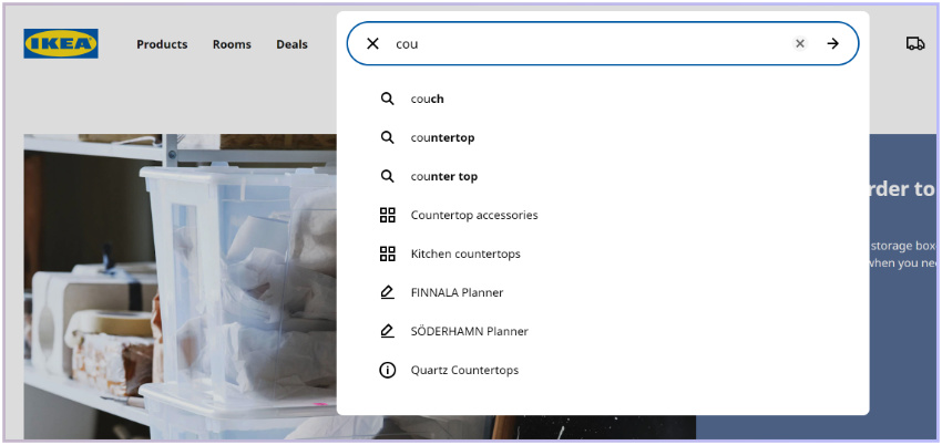
c. Style Different Search Suggestions Differently
As we have discussed, multiple different suggestion types may appear in your field, and you must help the user understand the difference between them.
Let’s say that besides predictive queries you also include products and/or product categories. If you group these together, make sure to differentiate them. For example, style the text a differently. e.g. giving it another color.
If all different types of suggestions are displayed as the same, the users might not understand the difference, and ignore them or choose ones that aren’t really relevant.
Small changes in style make it easier for the user to scan the presented suggestions, and focus on those they are interested in.
d. Style for Readability
Especially on mobile devices, it’s very important shoppers can actually read the suggestions, and also easily select the ones they are interested in.
Keeping readability in mind, the suggestions should be presented in a large enough font size, and with enough spacing, maybe even with separators, so that tapping on them doesn’t lead to accidentally selecting another option.
5. Provide Clear Instructions
The exact functionality of an autocomplete feature may not be completely clear to users right away, especially considering how different on-site search solutions can be.
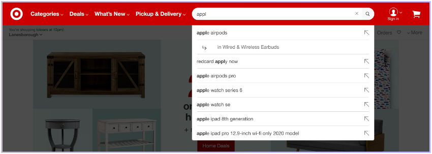
In order to help them use the feature, providing instructions and labels can be greatly useful. These may include headings in the list, e.g. separating “Search suggestions”, “Categories”, “Articles” and so on.
This will help users understand how the list is structured, scan it more easily and direct their attention to the ones that are relevant to them. Without clarifying these details, mixing the different suggestions into one list, the user may pick an article instead of a product, or go to a category page instead of a more general results page despite their initial intention.
6. Visual Focus and Simplicity
When the customer is using the search feature, the autocomplete field together with the search box should be given absolute priority in terms of visual attention.
a. Design for Visual Depth
Giving the autocomplete field priority can be easily achieved with darkening the rest of the site – the background in this case.
This will help fade the elements on the site that are fighting for shopper attention – CTA buttons, banners, product photos and so on. This way, the customer can easily keep their focus and not get distracted.
b. Reduce Visual Competition
On mobile, directive elements like navigation or shortcuts may appear beside or even above the autocomplete field, which actually ends up making navigation problematic and distracting.
Be careful where you place your live chat option, an icon for the shopping cart, or even sticky headers, to make sure it doesn’t detract from the search experience.
By minimizing these distracting elements, you can minimize mis-clicks and provide a much smoother experience.
7. Support Both Mouse Interaction and Keyboard Navigation
Customers should be able to see which suggestion they are hovering over. This can be done by highlighting the given row. You may also invoke the hand cursor to make it clear that they can click the suggestions and it will take them to a result page.
It’s important to provide keyboard navigation (especially since we mostly use Google for off-site search, and it has trained us to use this functionality).
Using the up and down arrows, customers should be able to switch between the suggestions, and select one by hitting Enter.
8. Mobile Specific Optimizations
There are a few things that are very, very important to keep an eye on when designing autocomplete for a small screen.
Here are the most important ones:
a. Use Text Wrapping
We already mentioned how you shouldn’t try to expand your suggestion field with a vertical scroll bar. We also recommend not using a horizontal one. Many suggestions, including long or multiple keywords, won’t be able to fit in their row, given the limited screen size and that you must use a big enough font for readability.
If you just shorten the suggestion by including “…” at the end, you confuse the customer who won’t know exactly what they might be clicking on as part of the info is missing.
So how do you solve this problem?
Use text wrapping and expand suggestions to multiple rows as needed, even if this means fewer will be visible.
Providing adequate information before the customer has to commit to a click is essential.
b. Partially Obscuring the Last Visible Suggestion
On mobile, scrolling is unavoidable in many cases, especially if you have to wrap search suggestions.
Instead of adding a scrollbar, there are a few other things you can do.
The best one is probably partially obscuring the last result – which is a clear indication that the list continues below.
Now, considering the different screen sizes, browsers, fonts etc. it’s nearly impossible to get this right every single time because there are just too many variables.
So what you might want to do is check your analytics, find out which devices are used the most to access your store, and optimize for those.
Most users will still be selecting one of the suggestions that are visible right away, but with this method, you can provide a smooth experience for those who want to explore the whole list.
c. Make it Easy to Exit Autocomplete (and Remove the Search Input)
If a customer decides they no longer want to use the search bar, and wants to return to browsing the site, it should be easy for them to do that.
Providing an “X” icon to delete the query and search bar suggestions instead of asking shoppers to do it manually, is a handy solution to enhancing shoppers browsing journey.
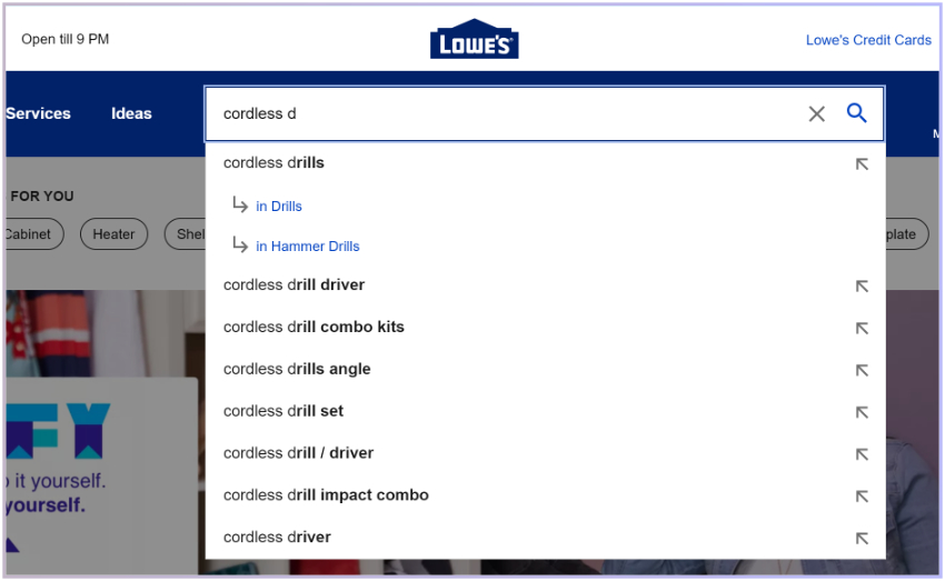
9. Provide Category Search Suggestions
When a customer starts to type a query in the search bar, they might just want to explore what you have in a given product category.
Providing them with category suggestions is a very convenient way to enable them to browse your products and find the one they want to buy.
This saves time for the customer and provides a clear path, making the user experience smoother.
However, you want to avoid visual clutter and confusion – as we have discussed before – clearly indicate that category suggestions are not keyword suggestions. Do this with a simple heading and/or by using a different style.
10. Speed is Essential: Real-Time Autocomplete
Your autocomplete should always provide suggestions in real time.
If it’s slower than that, it can be downright irritating for the user, as they can visually perceive the lag – like with a website slowly loading individual elements.
If the autocomplete is not real-time, all of the above best practices are worthless as no one will be using a search bar they perceive as not useful.
Suggestions have to appear right when the first character of the query is entered, and should change with every subsequent keystroke to be updated to show relevant options.
Summary
Providing the highest level of quality during a customer’s journey will help you directly increase your store revenue. A better search experience leads to higher satisfaction, better experience, and overall higher conversion rates and average order value.
By using the best practices in your store, you can achieve exactly that.
Remember the most basic guidelines:
- Autocomplete should work in real-time.
- It should provide relevant results – which can be personalized.
- It should provide clear visual guidance as to how to use it.
- If it’s in use, all other site elements should be faded into the background.
Of course it can quickly get complicated, and fine-tuning can be time-consuming to keep up with. This is why, to achieve the best results, we recommend working with on-site search experts.
As always, if you have any questions, or suggestions for the expansion of this list, reach out to us!

Paige is the Head of Marketing at Prefixbox, a leading eCommerce site search solution. She’s an American who’s been living in Budapest since 2017 and loves giving #alwayslearning sessions to help people optimize their online stores.
