No Results Page Examples: 12 Designs That Reduce Bounce Rate (+ UX Best Practices)
No matter how much optimization you do, it’s inevitable that some searches on your online store will lead to no-results found pages. Planning for these inevitable dead-ends should be an integral part of your UX design from the start. Search is the most important tool in guiding shoppers to products, but even if you follow all of the most important eCommerce search best practices, “no results found” pages still happen.

Chapter 1
No results, no control

Chapter 2
The Best No Search Results Found UI Design Guidelines

Chapter 3
The Best eCommerce No Results Page Examples

Chapter 4
No Search Results Found UI Design Best Practices
Having a great “no results found” page design is an enormous opportunity for you to build trust with your customers, but you can only do that if you design these pages consciously.
Even though these pages are critical to a online store, according to Baymard, “68% of e-commerce sites have a “No Results Page” implementation that is essentially a dead-end for users, offering no more than a generic set of search tips.” Which also means that customizing your page in a user-friendly way is an opportunity to do get ahead of your competitors. And it only takes minimal effort.
Why are these pages so important?
It’s because these pages keep shoppers on your site even though they can’t immediately find what they’re looking for. If you have a great “no results found” page, you can effectively re-route the shoppers and help them make another purchase. Whereas, with a bad “no results found” page, the shopper will most likely leave your site and go to your competition instead.
This is a big deal. You can avoid this by thinking of the following:
No results, no control
It’s important to note that while you should aim to guide shoppers with a search bar, this also gives them a sense of confidence and control over their shopping experience. This sense of control is important in creating a good user experience and building brand loyalty with your customers.
Landing on a “No Results Found” page that doesn’t provide alternate products or information on what to do next, can easily make shoppers feel like they’ve lost control over their shopping experience.
Why does this happen?
As Nielsen states, shoppers don’t always realize that they arrive at a “no results found” page, simply because conducting searches on the web is such an integral part of our daily lives – we are wired to expect certain results within a certain structure. That is: some information on the top about the search that was just performed, which could usually be skipped over, and the relevant results below.
In case of a “no results found” page, information about what happened is usually included in the spot that people often skip over, so they don’t realize they search didn’t return any relevant results. Shoppers are often surprised when they see other webpages or products where they expect the results to be. This often confuses shoppers and leads to a negative experience on your website.
This is why providing tips and alternative products, in a way that the user actually reads them, is very important.
In this article we are going to look at some awesome examples of “no result found” pages.
But first, we have to talk about the basic guidelines of how these pages should be designed.
The Best No Search Results Found UI Design Guidelines
Now that you see why “no results” pages are so important, let’s check out the best practices for designing pages that help reduce your site-abandonment rate.
Clearly explain what happened
Clear up any potential confusion at the first opportunity to do so.
And be sure to do it in a way in which the shopper actually sees your message – otherwise it’s pointless.
To figure this out, do a heat map analysis of your search results pages, and put the information about the failed search in the place shoppers instinctively look first.
You don’t have to over-complicate this: just tell them the search term they entered yielded no results, but they shouldn’t just stop searching. It often happens that the product they’re looking for is in-stock, it just didn’t turn up due to a typo or a difference in naming.
Always take the blame
Always start these messages with an apology.
Even if you just include something like “our bad”, “sorry”, “apologies for this” in the text, it eases the frustration the shopper might feel, and will help keep them on the site and take the alternative routes you provide.
Speaking of which…
Provide alternatives
Never leave the user with just a notice and apology: always engage them, urge them to try again, or to take further action on the site.
Keep in mind, your site is likely not the only one they are browsing: if their search ends in no results found in your online store, chances are, they’ll leave and go to one of your competitors.
Check their spelling
Actively provide tips if the shopper misspells a word.
Instead of simply informing them that they misspelled a word, you should provide a clickable version of the right spelling that will immediately direct them to the results page (yes, like Google and other search engines).
Suggest similar results
You can do this in a number of ways:
- Suggest similar keywords and products based on their initial search term with Related Searches
- Make personalized product and keyword suggestions based on their previous shopping behavior on your site
- If you can’t track their behavior, at least offer products that are popular among your other customers.
And if this is not enough…
Engage
Even if they can’t reach the product they’re looking for, provide some alternatives for staying in touch.
Include your contact information (email, phone number etc.), or valuable content, links to your social channels, or a newsletter sign-up form that asks for their email address.
The goal is to not let go of their hand, in hopes that later they will return and make a purchase.
And now, let’s check out how some of the best websites out there make use of these best practices in their search results page design…
The Best eCommerce no Results Page Examples
We covered all the best practices, so are you ready to see them in action?
Get some inspiration for your “no results found” pages from the following examples!
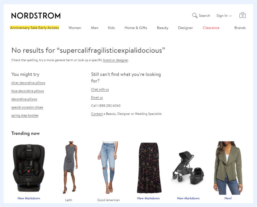
Nordstrom
The two basic things that Nordstrom does right here are:
- They provide clickable, relevant alternatives based on the keyword provided.
- They provide an alternative way of finding the desired product via direct contact.
Note: they don’t only suggest contacting themselves, but also recommend a relevant specialist to contact if you’re not sure what you’re looking for (and provide you a direct path for doing so).
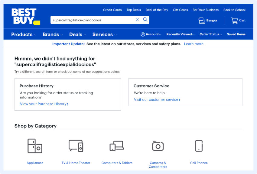
Best Buy
What they do well is that:
- They offer a way to circle back to your history on their site: view and track previous orders
- They provide an option for easily contacting their customer service in case you need more help.
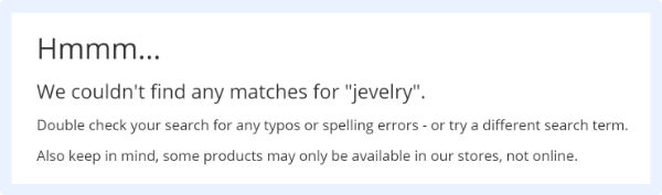
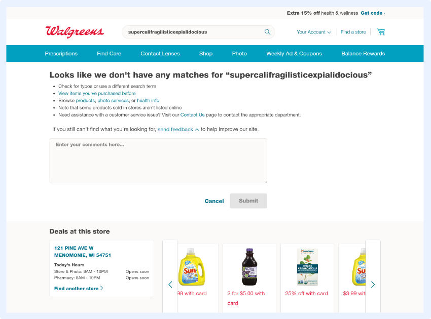
Walgreens
Walgreens excels at helping shoppers retry or refine their search, by giving clear tips and instructions:
- Directing you to a log of your history on their site
- Informing shoppers that not all of their products might be on the site
- Providing shoppers with a chance to contact customer service
They also provide a feedback field, which could collect valuable user information they could leverage to further improve.
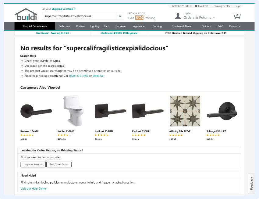
Build.com
The search results page at Build.com, even with no results, is informative and offers several ways to proceed, including:
- Multiple suggestions on how to fix the search query
- Logging in to check your order history
- Suggesting alternative, popular products
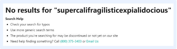
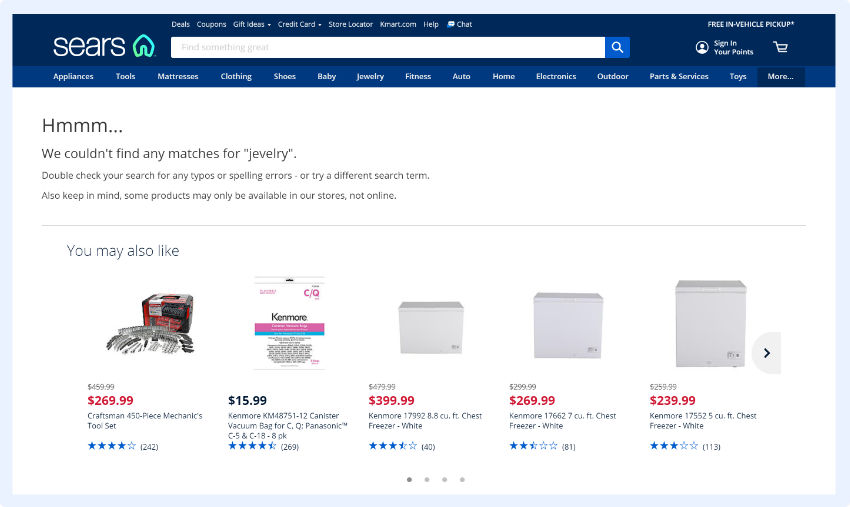
Sears
At Sears, they not only explain what happened, but they also suggest other, relevant products based on your previous activity.
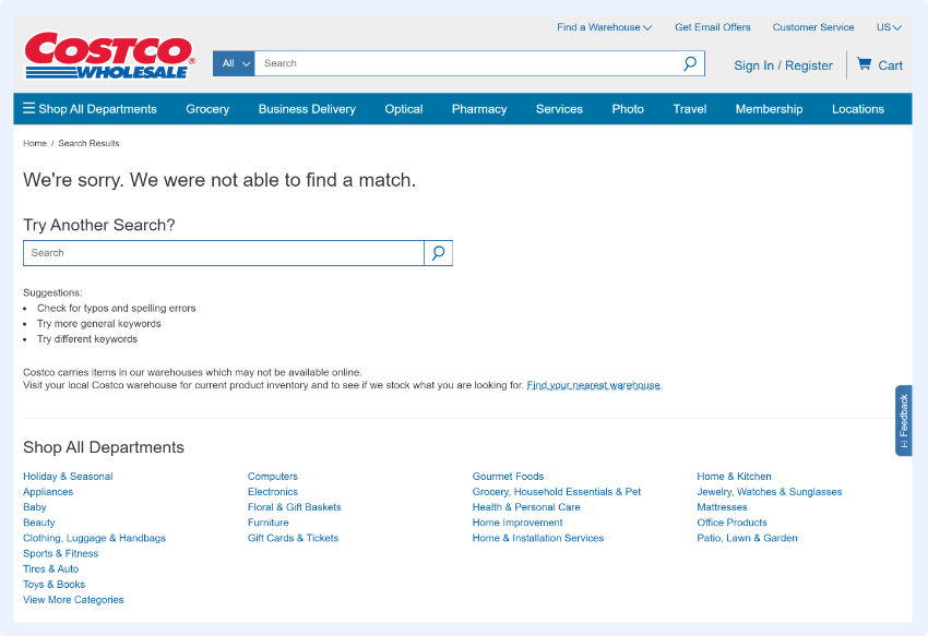
Costco
Take note how Costco designed their “no results found” page:
- They apologize
- They provide an easy way for shoppers to execute another search and even include an extra field for doing so where the results should be (where shoppers instinctively look first).
- They provide suggestions on how to re-execute the query, as in: check your spelling, try more general or different keywords.
Although, they miss an opportunity by not offering alternative results based on popularity or user behavior.
Ikea
The main reason their “no results found: page is user friendly is because they immediately show the search query, which is a great way to enable shoppers to identify and fix typos.
This comes along with an apology, to take away some of the frustration. And to alleviate the rest, they also offer alternative, personalized product suggestions.

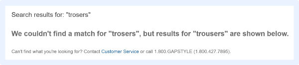
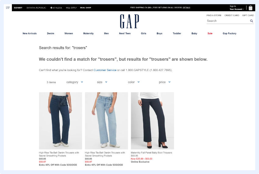
GAP
GAP is great because they actively identify typos.
And just like Google, they immediately show results for the keyword you might have misspelled.
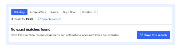
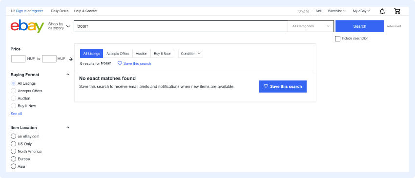
eBay
eBay has a unique, highly effective tactic on their “no results found” pages – they enable shoppers to save their search and set alerts for when the desired product becomes available.
This is the best idea for a zero results page I can think of.
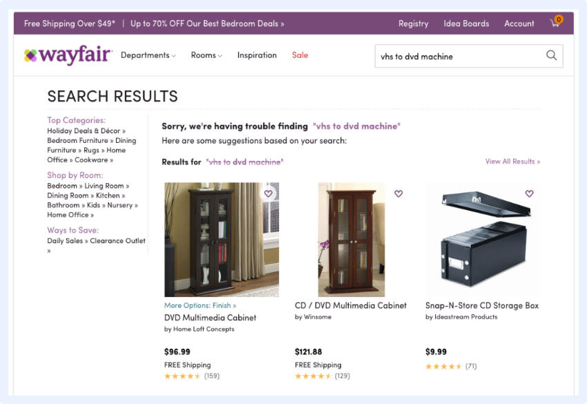
Wayfair
Here, you can see a great example of how search result page design can be user-friendly: shoppers are not only given information on what went wrong with the search, but the search engine actually takes that search query and uses the individual keywords to provide other relevant result suggestions.
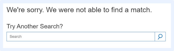
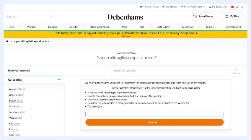
Debenhams
Again, the focus here is on immediately providing help: by placing a search bar in a shopper’s line of sight increases the chance they’ll stay on your site and make a purchase.
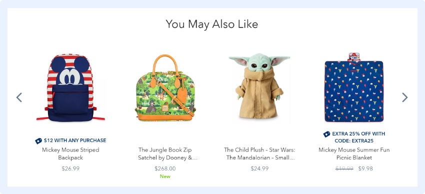
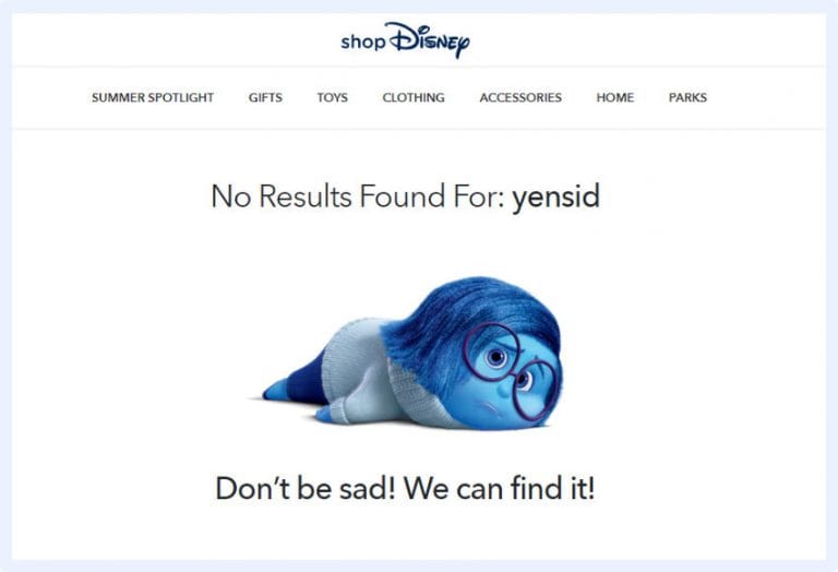
Disney Store
Finally, a unique example.
This “no results page” design isn’t very helpful, but it’s still user-friendly.
Disney simply uses some humor to ease possible tension for hitting a dead end and urges shoppers to continue.
You should consider using cute or funny images or language as part of your “no results page” design as it can make your online store more relatable and memorable. By creating an enjoyable shopping experience for your customers, you’re more likely to generate brand loyalty.
No Search Results Found UI Design Best Practices
A shopper who uses the search function on your online store has a strong purchase intent. According to the Demac Media’s Q3 2016 Benchmark Report, users who use the site search are 216% more likely to convert than those who don’t.
No matter how much you optimize your site search, “no search results” pages are inevitable. So it’s essential you spend some time optimizing these to help shoppers continue on their buying journey.
You’ll provide your customers with a better user experience and see an increase in your conversion rate and a decrease in your site abandonment rate.
When designing these pages, the main things to keep in mind are:
- Be helpful
- Always provide a way for the shopper to immediately continue shopping
- Don’t leave shoppers staring at dead ends without offering help
What is a no results page?
A no results page is the screen a shopper sees when their search query returns zero matching products. Instead of showing an empty list, a well-designed no results page offers alternatives (related products, popular categories, or a corrected search) to keep the shopper engaged rather than bouncing.
What should a no results page include?
An effective no results page should include a clear message explaining that no results were found, a search bar pre-filled with the original query so the shopper can easily refine it, alternative suggestions such as popular products or trending categories, and optionally a way to browse by category or contact support.
How do I reduce my no results rate?
he most effective ways to reduce your no results rate are: enabling synonym matching so ‘sofa’ and ‘couch’ return the same results, adding typo tolerance to handle misspellings, expanding your search index to include product descriptions and attributes, and regularly reviewing your top zero-results queries in your site search analytics to identify gaps.
What should I show instead of no results?
Instead of a blank page, show: trending or bestselling products, products from the closest matching category, a ‘Did you mean?’ suggestion if the query looks like a typo, and a prompt to browse by category. Some retailers also show recently viewed items, which keeps the shopper in a buying mindset even when their specific search fails.

Paige is the Head of Marketing at Prefixbox, a leading eCommerce site search solution. She’s an American who’s been living in Budapest since 2017 and loves giving #alwayslearning sessions to help people optimize their online stores.
